TB.One > Order Data and Order Processing > Statistics and Dashboard > Order Evaluation and Diagrams
Order Evaluation and Diagrams
TIP: If you need long-term insights, TB.360 provides up to 36 months of historical data. |
At "Home > Order evaluation > Chart", you can find a comprehensive tool for creating personalized charts.
GRAPH VIEW
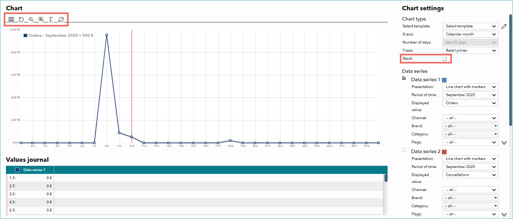
Configure the settings for the current chart in the menu on the right.
DIAGRAM OPTION |
DESCRIPTION |
|---|---|
Select template |
If you have already created a template, you can select it as the basis for a new diagram. |
X axis |
Choose between different options for the X axis. Hover the cursor over the chart to display the exact value in the legend. Time axes; either by order date (date the channel received the order) or creation date (date the order was created in TB.One): •Calendar month: shows daily values for each month selected in the data series •Calendar year (daily values): shows daily values for the years selected in the data series •Calendar year (in weeks): shows weekly values for the years selected in the data series •Calendar year (by month): shows monthly values for the years selected in the data series •Fixed number of days (previous X days): select the period of time from the drop-down menu below Other options (when selecting one of these options, you need to indicate a channel in the data series below; different options are available for the Y axis): •Price groups (1 ?;): groups the article prices in steps •Price groups (10 ?;): groups the article prices in steps |
Y axis |
There are several options available for the Y axis. What options are available depends on the X axis. If X axis = time axis •Retail prices: evaluates the calendar year(s)/month(s) selected in the data series by sales (price/value) •Quantity: evaluates the calendar year(s)/month(s) selected in the data series by sales quantity •Percentage: evaluates the calendar year(s)/month(s) selected in the data series by percentage (in relation to ordered articles); if you select "Percentage" for the Y axis, you need to indicate whether you want to view the returns or cancellation ratio in the data series •Days: evaluates the calendar year(s)/month(s) selected in the data series by the delivery reliability in days If X axis = price groups •Quantity: evaluates the values selected in the data series by quantity. If you use more than one data series, you can e.g. compare individual channels with each other •Percentage: evaluates the values selected in the data series according to the distribution in percentages. Choose between returns and cancellation ratio in the data series. |
In the data series, the evaluated data can be limited by supplier (TB.Market only), channel, brand, internal category, and/or flag.
If the checkbox "Stack" is active, the values from each active data series will be added to those from previous data series.
The buttons above the chart allow you to analyze it in more detail. You can choose zoom ![]() /
/ ![]() , calculation of totals
, calculation of totals ![]() , or calculation of averages
, or calculation of averages ![]() . Click on the respective icon and mark the chart's area you want to analyze with drag & drop. Sums and averages will be displayed in the top left of the chart.
. Click on the respective icon and mark the chart's area you want to analyze with drag & drop. Sums and averages will be displayed in the top left of the chart.
For further information, see also: